POOJA METKAR

Crafting Financial Journeys

Jupiter • 2023-24 • App Redesign

Background

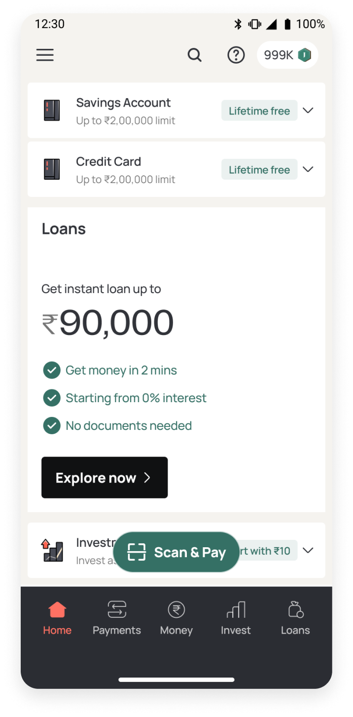
Jupiter is a digital banking app that helps users manage their finances. It offers savings accounts, UPI payments, loans, credit cards, a spends tracker, and various investment products - all in one place.

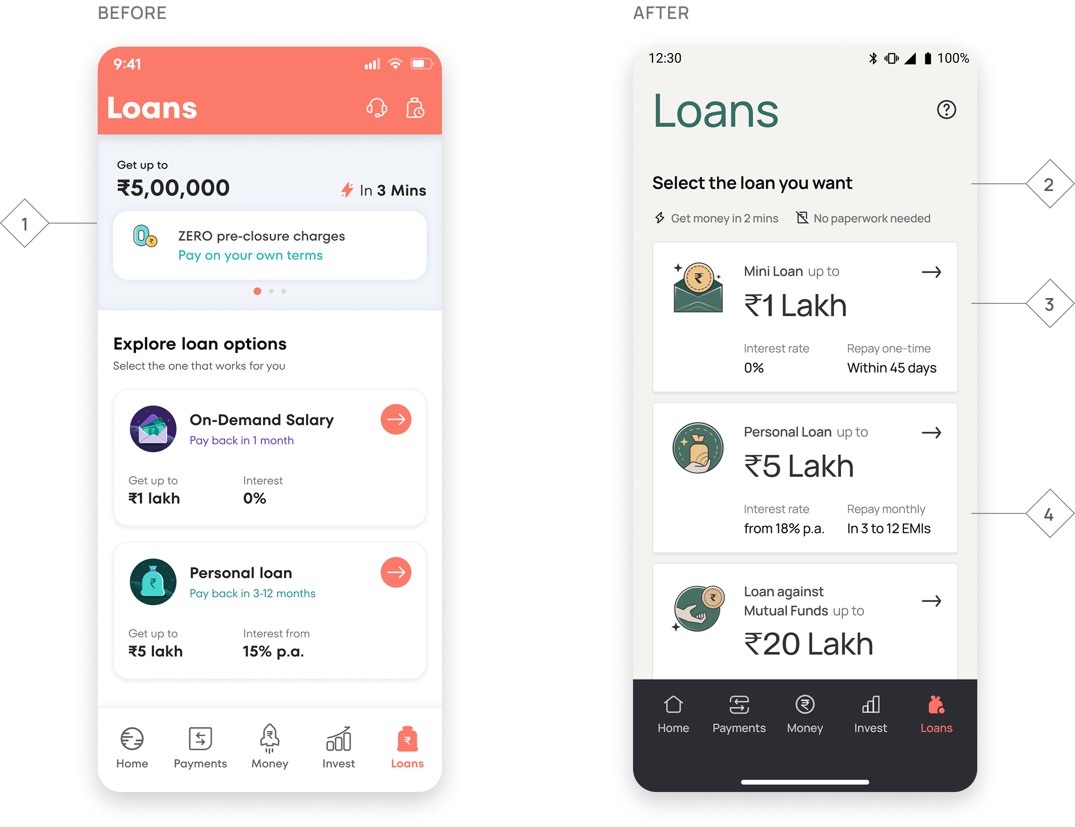
As we introduced more products and features, the UI started to feel cluttered, leading to inconsistencies across the app. The experience became confusing, information wasn’t structured clearly, and we struggled to build the trust we wanted with our users. It became evident that a redesign was necessary.

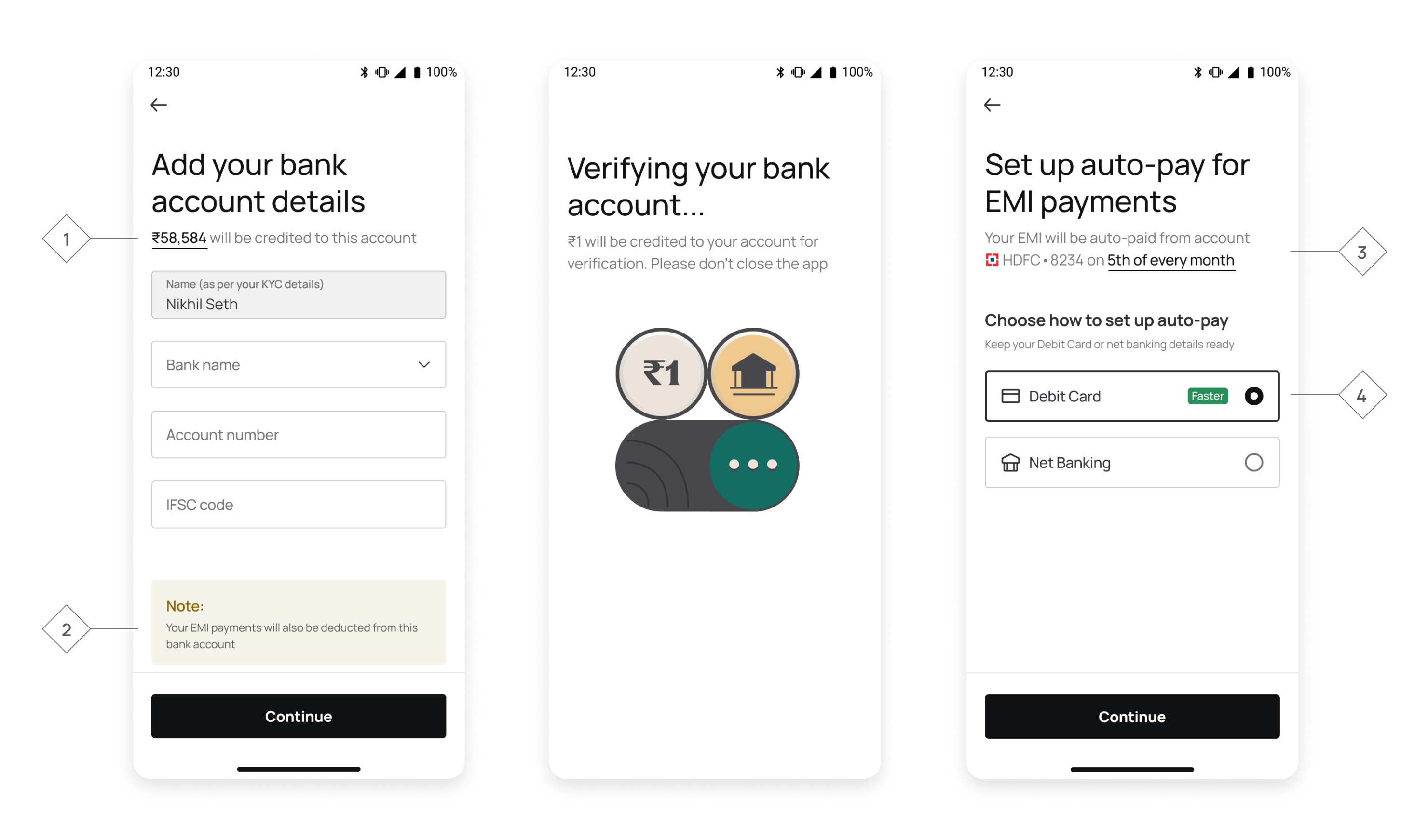
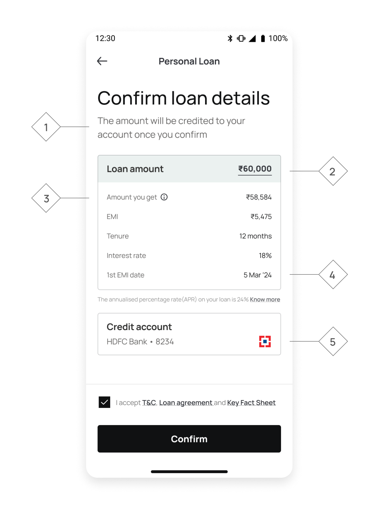
For users to trust us with their money, every screen had to feel personal and intuitive. We needed to remove the anxiety and fear that came with taking the next step, especially in journeys like taking a loan. We created new design principles to craft screens, numbers, and interactions in a way that will make users feel confident in their decisions.

I worked with product, business, data and risk teams to truly understand loans users - their age, income groups, credit profiles, loan purposes, when they typically used the app, and their aspirations as well as discomforts. These insights into users' minds helped me design journeys that genuinely supported them at every step of taking a loan.

My Role

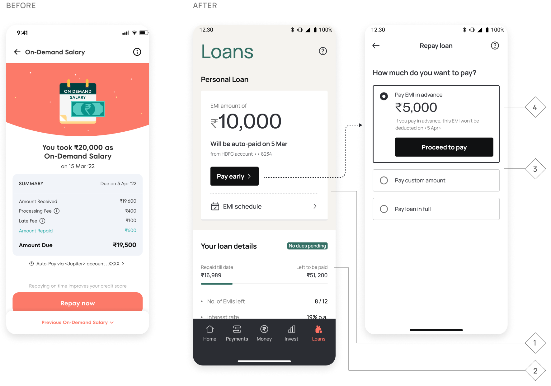
I led the complete redesign of loans experience, covering both pre & post-disbursement journeys. I worked with product leadership to shape journeys focused on clarity, transparency, and building trust.

The redesign covered:

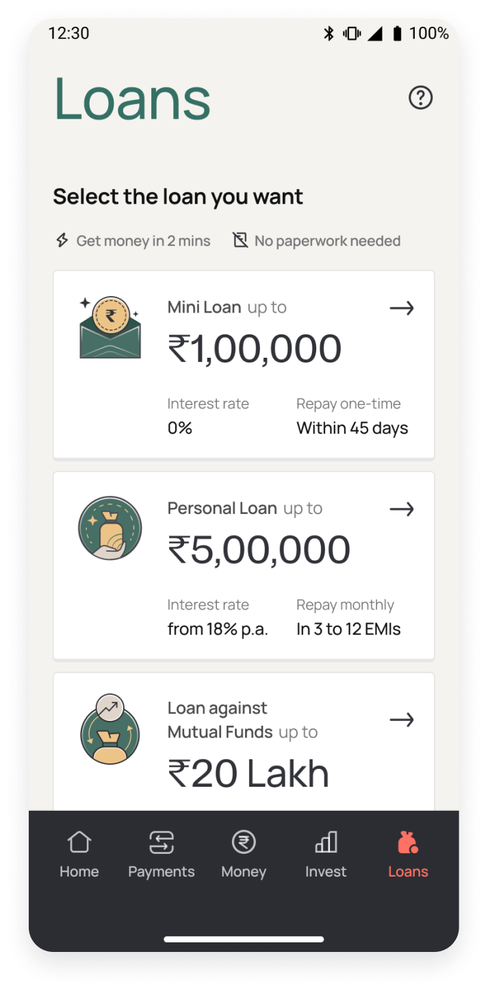
  • Onboarding & Discovery - Discovery on app home, loans tab redesign, loans identities
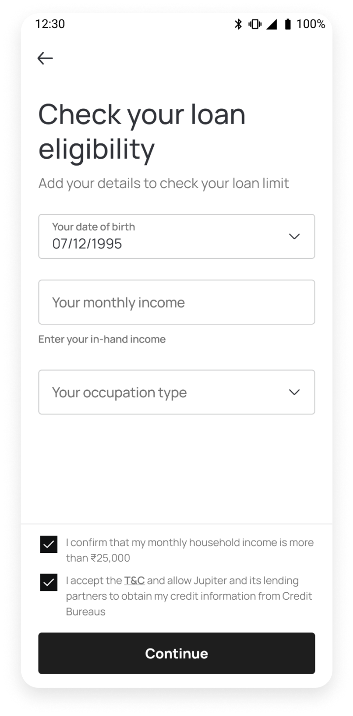
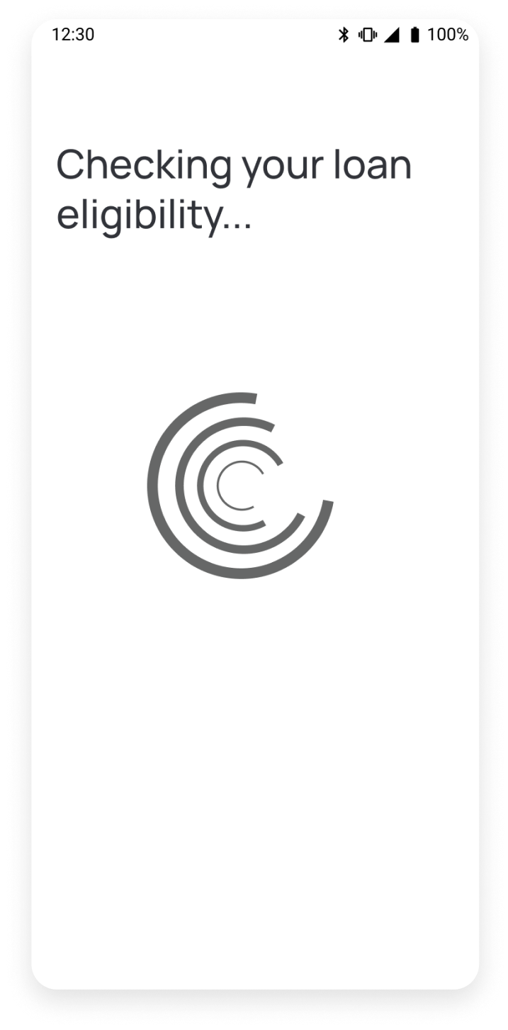
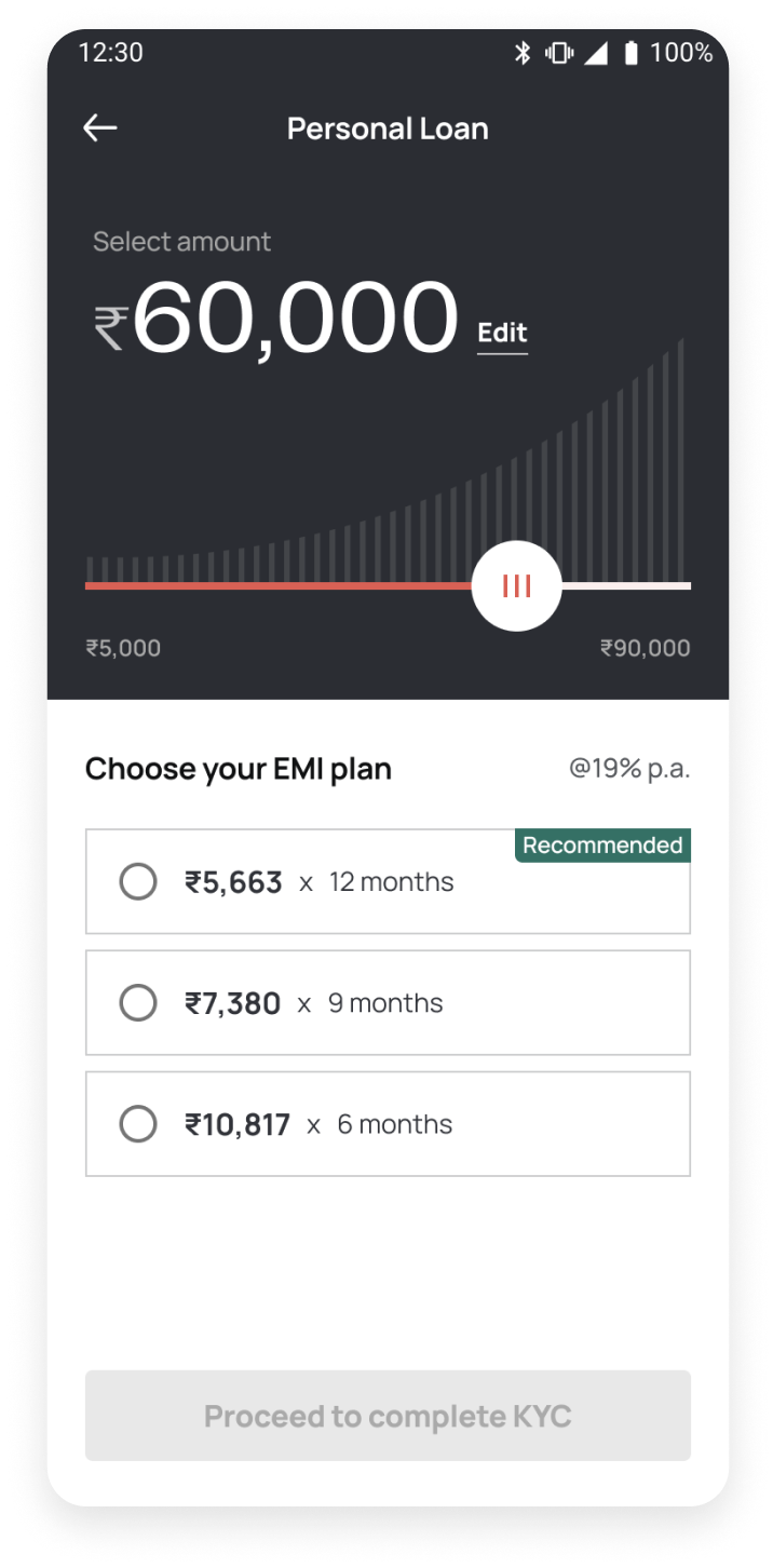
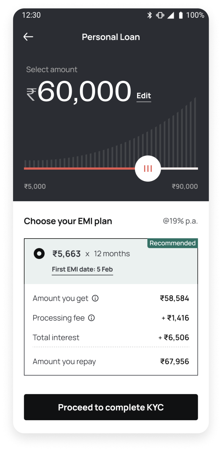
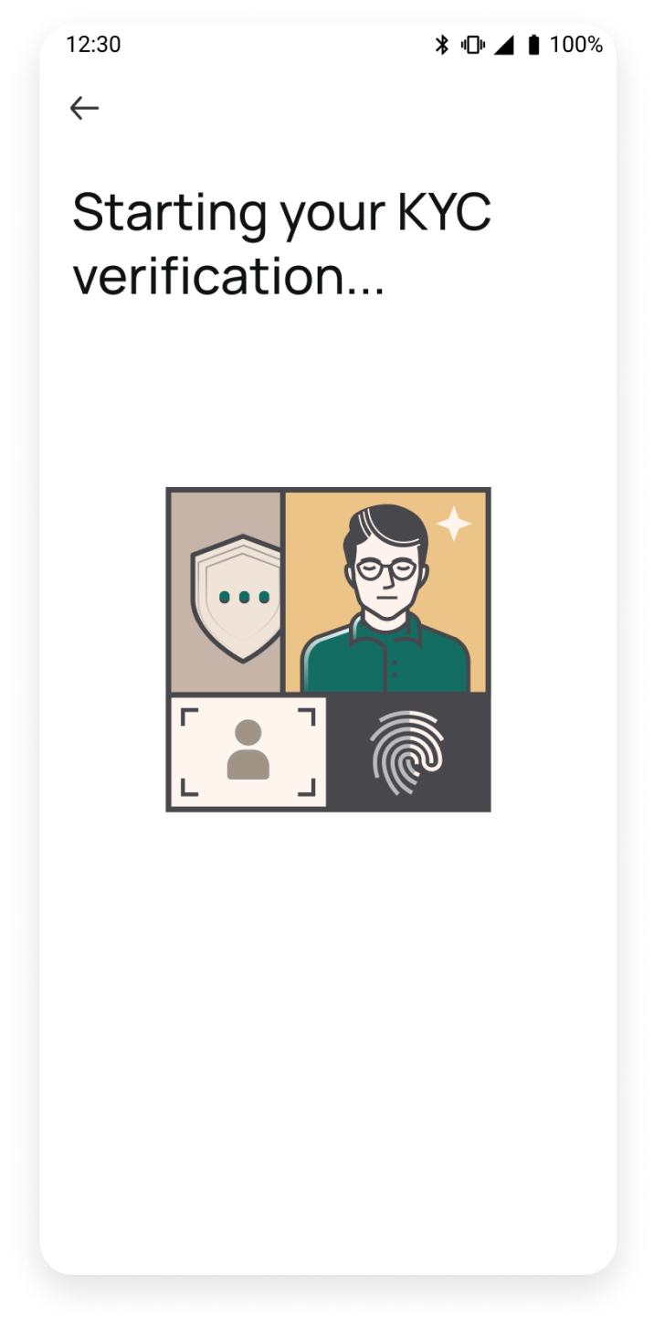
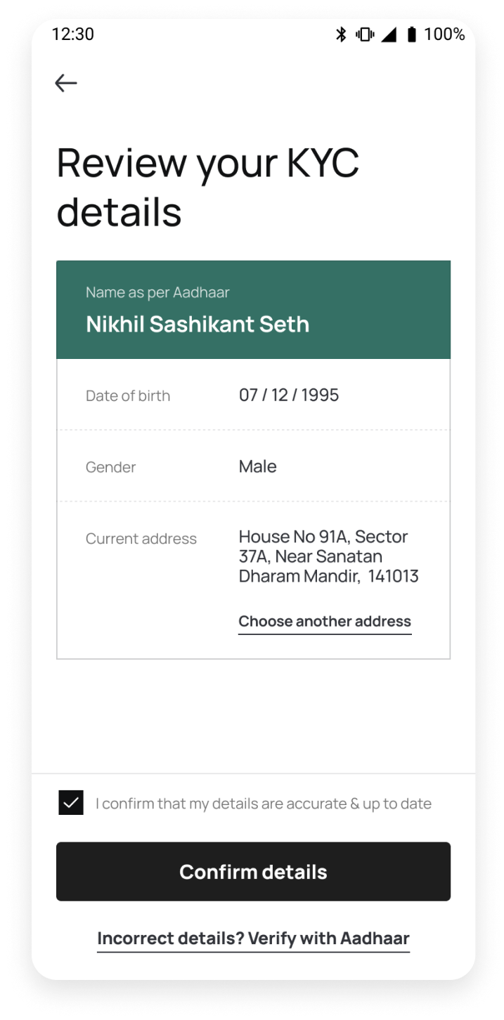
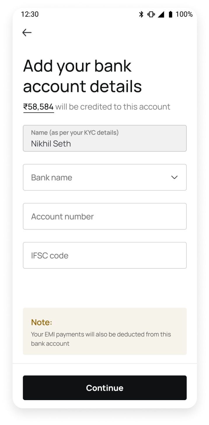
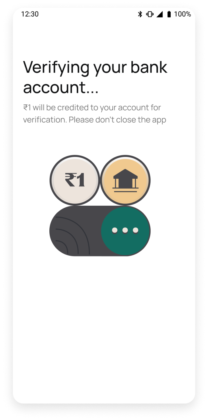
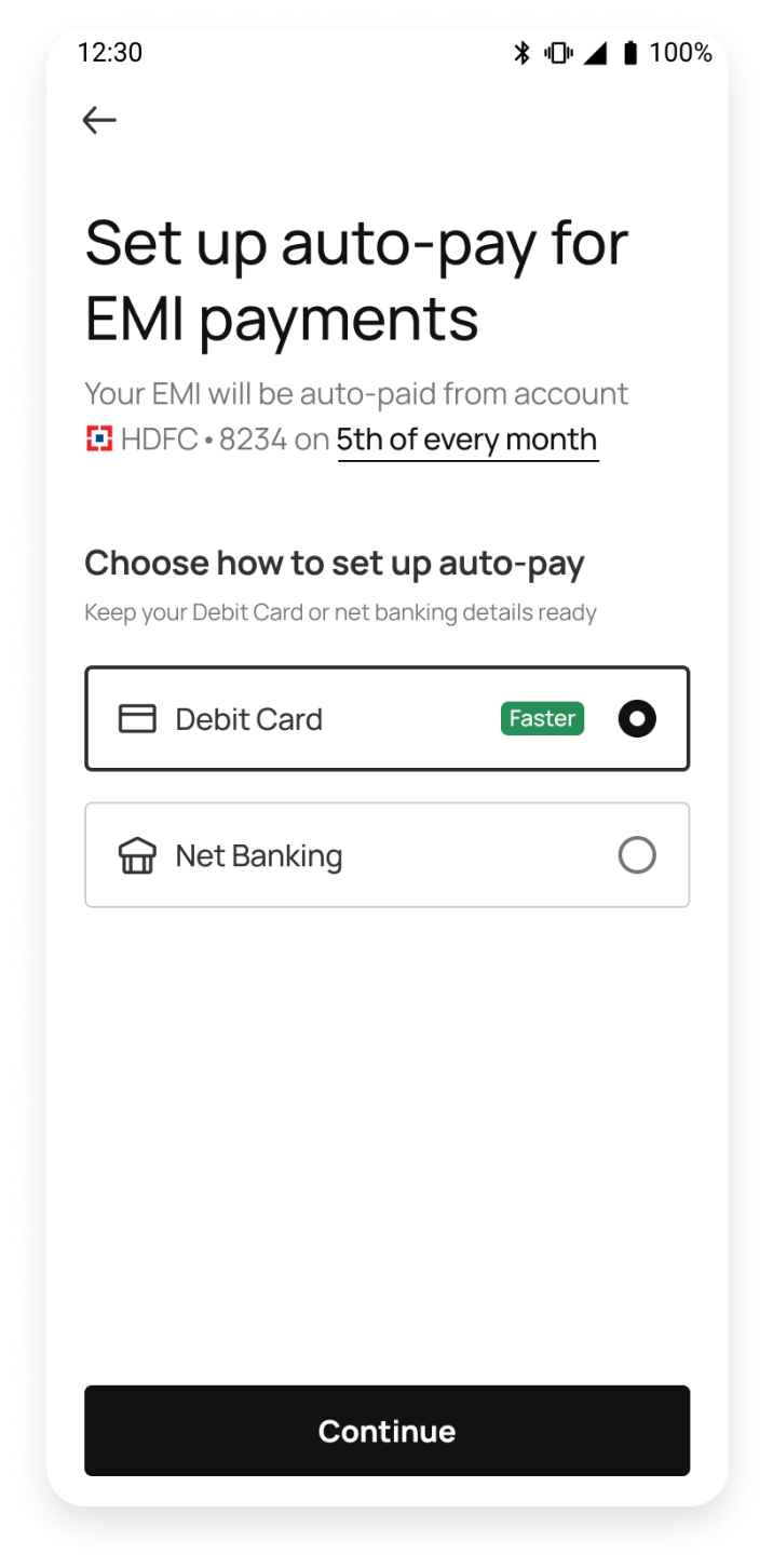
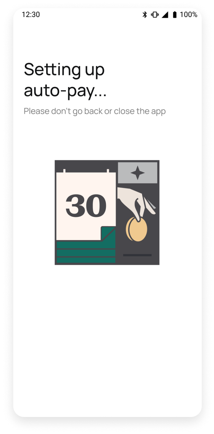
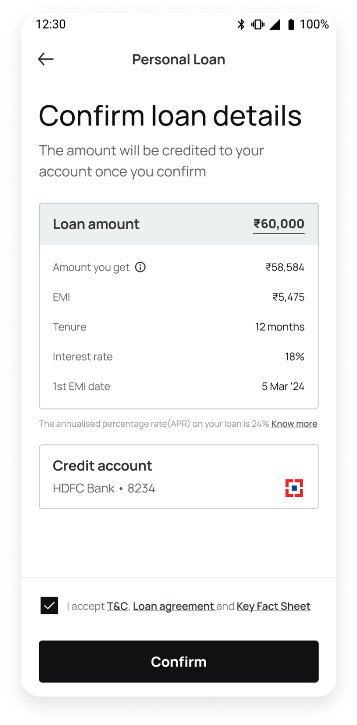
  • Loan application - Eligibility check, amount and tenure selection, video-KYC verification, bank account and auto-pay setup, journeys for dropped-off & repeat users
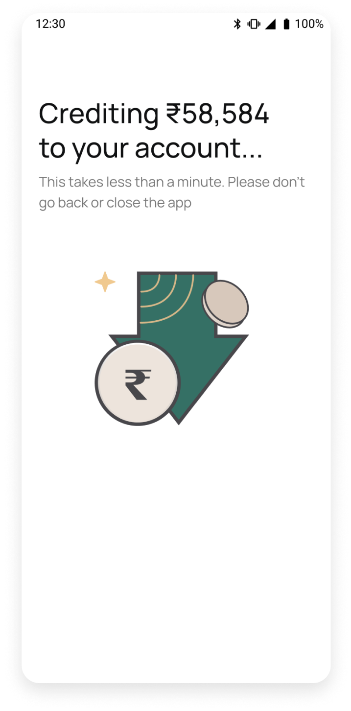
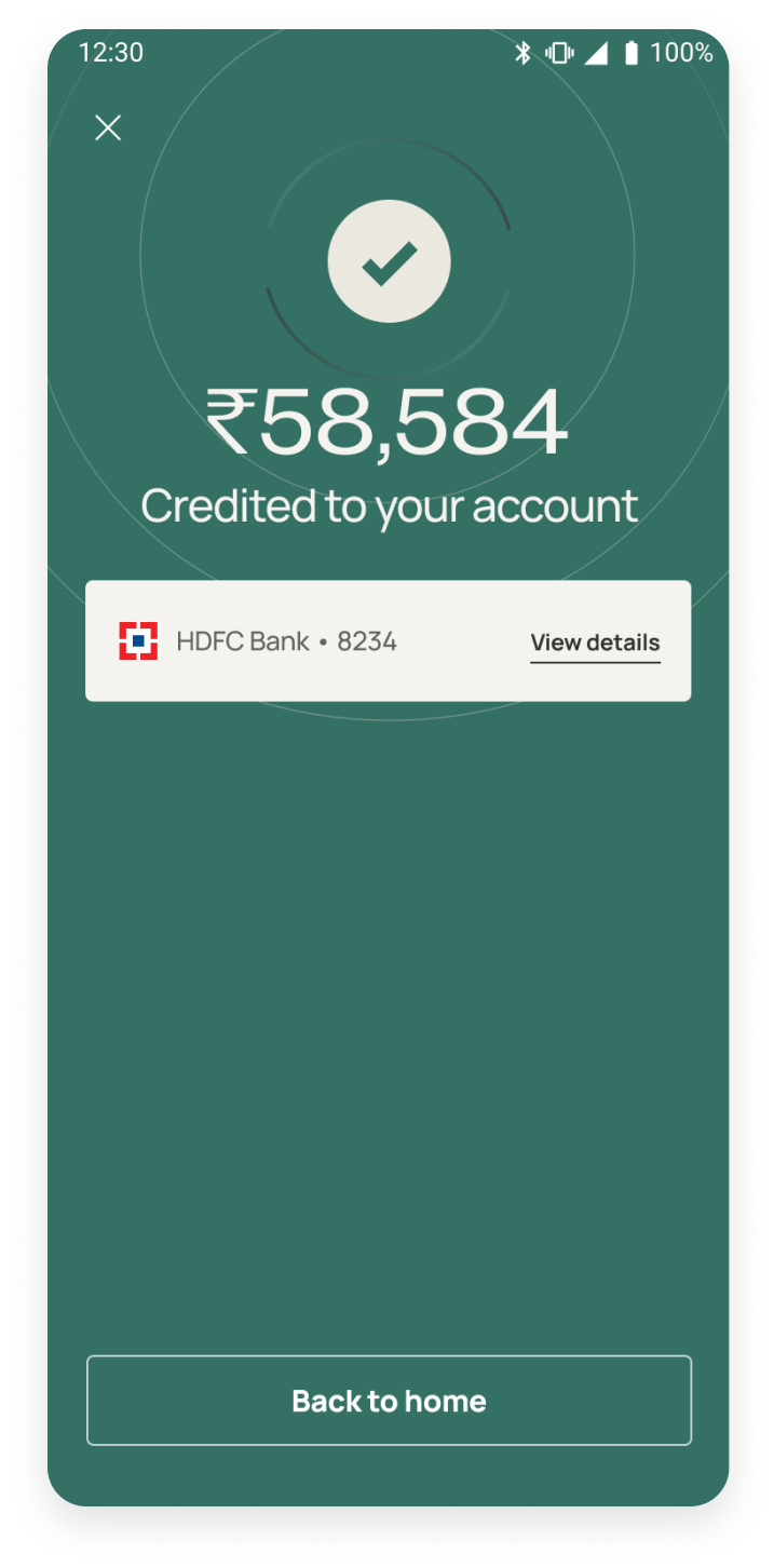
  • Checkout - Final review and disbursement
  • Post-disbursal Experience - Active loan management, repayment flows
  • Enhancements & features - Account aggregation, loan limit upgrades, offers on interest rates and processing fees, EMI insurance
four-pointer-star
Impact

We achieved a 24.8% increase in conversions for new users and a 27% boost for repeat users

Simplifying loan selection

The previous loans tab was cluttered with too many actions, leaving users confused. We asked ourselves, 'What’s the key task we want users to accomplish?'— selecting the right loan option.

1

The previous design had too many variations in font sizes and weights, making it visually cluttered. In the new design, we used with clear size differences to make it easier to scan

2

To guide users clearly to the next step, we changed the main heading to ‘Select the loan you want’

3

We made the loan limit bold and prominent to draw users’ attention to the most relevant information. Other details are grouped in a clean, organised manner to help users quickly compare options

4

We moved to a muted, cohesive colour palette to make our app feel more professional and trustworthy

Using animations for clarity

In the previous design, the amount selection screen was static, with the slider set to the maximum by default. This confused some users who didn’t realise it was interactive.

In the new design, we auto-animate the slider from the lowest to highest amount to provide visual cues and improve the landing experience. EMI and tenure options now load dynamically based on the selected amount.

Setting up auto-pay

Users need to add a bank account and set up auto-pay before receiving their loan amount. This can cause anxiety if accurate information isn’t provided. We addressed this by making key copy changes and adding helpful notes.

1

Specify the exact amount users will get, allowing dropped off users adjust the loan amount later

2

A note to clarify that users must use a single account for loan disbursal and repayments

3

Clearly explain that auto-pay is required for EMI payments, including the EMI date and account

4

We recommend using debit card details option as it has higher success rate

Checkout

After setting up auto-pay, the loan amount was instantly credited to users' accounts, often without them realising it. Users didn’t have a chance to review the details before disbursement. This led to 30% users foreclosing loans within first 3 days.

To address this, we added a checkout screen for users to confirm details before loan disbursement

1

Clearly state that the loan amount will be credited after confirming details to reduce user anxiety

2

Allow dropped-off users to adjust the loan amount at the final step for added flexibility

3

We Highlight only key details upfront, with an info icon for users to view full calculations for transparency

4

We show the first EMI date, which may change based on whether users complete the process in one go or return later

5

Emphasize the account for loan disbursal on the checkout screen as it’s crucial for users

The Disbursal Journey

Simplifying Repayments

Our earlier repayment flows had confusing information, leading to the highest number of CS tickets. Users felt anxious about their EMI payments because they couldn’t clearly understand the exact amount due, payment dates, auto-debit timelines, or which account the money would be debited from.

Additionally, users couldn’t access their EMI schedules or track repayments. Based on this feedback, we decided to redesign repayment journey

1

In the new design, upcoming EMI details are prominently displayed at the top of the Loans tab, including the due amount, EMI schedule, and auto-debit account. To reduce user anxiety, we added clear, reassuring copy that states the EMI will be auto-debited on a specific date

2

Users can now easily track their loan status. Key information like the amount paid, remaining balance, number of EMIs paid vs left, and the last EMI date is displayed

3

Consolidated all repayment options like Advance EMI, Foreclosure & Part-prepayment in one location, allowing users to choose how they want to repay

4

Showing only essential details like payable amount

LINKEDIN INSTAGRAM MEDIUM
poojametkar.id@gmail.com