POOJA METKAR

Onboarding

Vedantu • 2022 • New User Experience

Background

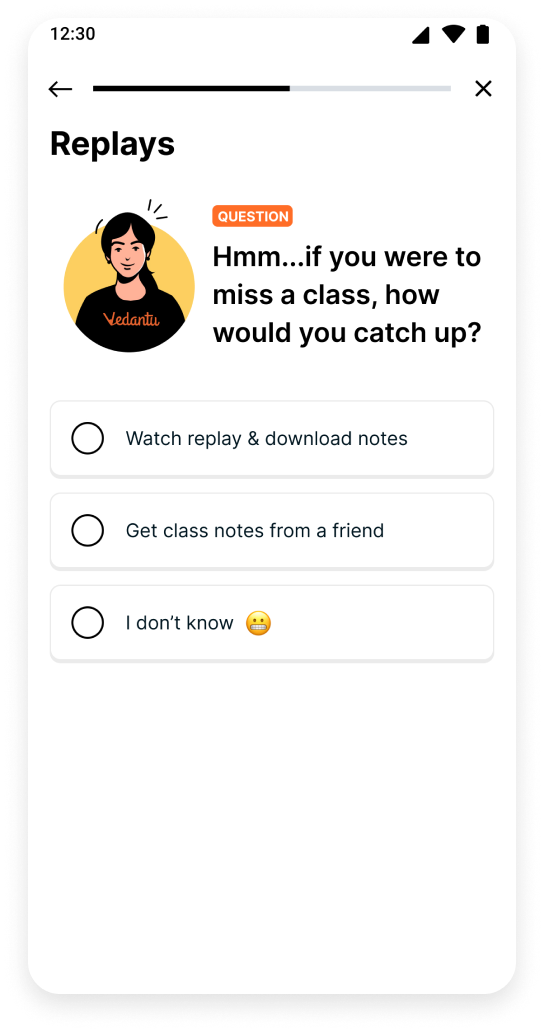
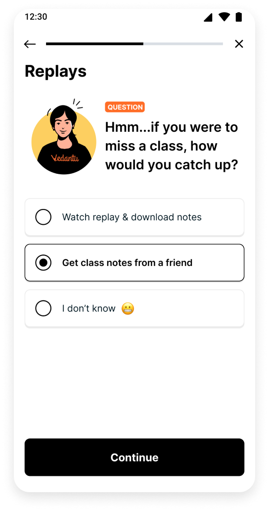
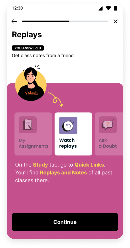
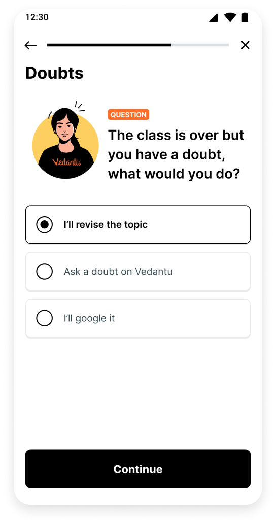
The existing student onboarding journey had several gaps. It was only available on the website and onboarding video completion rate was as low as 10%. Onboarding didn’t guide students on managing courses, navigating the platform, or accessing daily tasks.

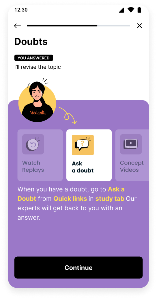
50% of the queries were related to these issues. Student Academic Mentors (SAMs) spent significant time helping students with course management, schedules, and study materials, yet overall student satisfaction was only 4.64 / 10.

Our Objectives

Using existing data, we identified the key tasks students need to complete during their first few weeks at Vedantu. This helped us define goals to improve the onboarding experience

User Goals
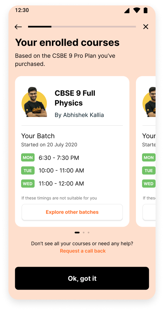
  • Simplify batch switching when needed
  • Help students understand the different offerings available on Vedantu
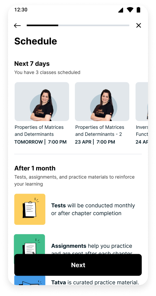
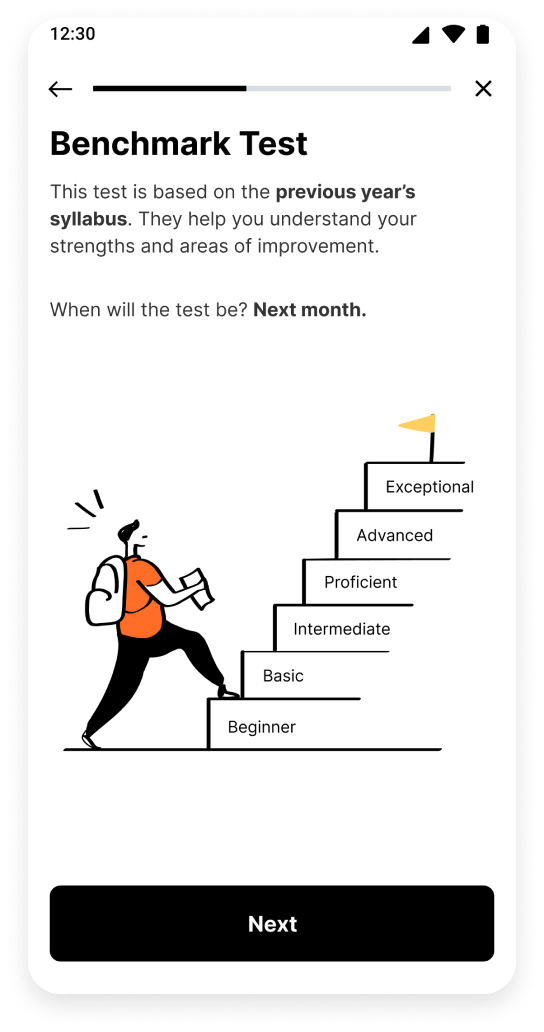
  • Set context for upcoming tasks and preparations
Business Goals
  • Reduce user incidents, lowering the cost of call resolution for SAM and Customer Care teams
  • Improve the NPS score by minimising friction in the early days of paid user journey
four-pointer-star
Impact

Support tickets about batch timings dropped from 30% to 25% in a month, and students managing batch switches on their own increased from 7% to 9%

An A/B test showed that only 8% of those using the old flow completed onboarding (1384 students), compared to 58% completion for the new flow (1100 students)

Design Sprint for Ideation

We conducted a remote design sprint to align on goals and collectively decide an approach to solve the issues faced by students

How might we make onboarding personalised for each student?

How might we reduce the number of queries we get from students?

How might we use fun and engaging ways to educate about product offerings instead of videos?

How might we make it easier for students to connect to us for any queries?

How might we show users how long they have left in onboarding?

How might we help students understand how to switch a batch?

How might we make students aware of offerings within their subscription?

How might we make information around course details, choices more accessible?

How might we encourage students to take benchmark tests?

How might we makes students know where to find their day to day tasks?

How might we help students select teachers of their choice?

How might we help students get visibility on language being taught in class?

Approach

We wanted to help students with their courses and also highlight key features as they explored the platform.

To make the process engaging and more personal, we created an avatar inspired by Vedantu teachers. The avatar helps build a connection with students by introducing features in a fun and interactive way, using simple questions and answers.

Final Designs

We start by showing students the main courses included in their subscription, allowing them to switch batches if class timings don’t work for them.

Next, we display their schedule for the first week to set expectations. Core features are introduced through fun, interactive Q&A. At the final step of onboarding, we remind students of their first class time, preparing them for their first task.

Getting started

Primary courses in the subscription

Students can explore other batches

Upcoming schedule

Benchmark test explained

Feature walkthrough

Introducing replays feature

The top progress bar shows how far along you are in onboarding

Home > Quick Links > Replays

Introducing Doubts feature

Home > Quick links > Ask a doubt

Ready to begin

Usability Testing

We conducted usability tests with 20 students in two cohorts to gather feedback on the new flow and check if they could complete the intended actions.

  • Cohort 1 - 10 Students, new to Vedantu, with less than 2 weeks of platform usage
  • Cohort 2 - 10 Students with more than 3 months of platform usage
Key Findings

Some students struggled to understand terms like primary courses. When explained as enrolled courses, they understood it better.

Students preferred images over text for navigating features

They wanted clear information about topics and syllabus covered for benchmark tests.

Students found the new onboarding visually appealing and better than the existing one. They especially liked the teacher avatar, colours and Q&A format

Overall Feedback

Students found the new onboarding visually appealing and better than the existing one. They especially liked the teacher avatar, colours, Q&A format and first week schedule.

Average rating for new design - 4.6/5 (based on 20 ratings)

LINKEDIN INSTAGRAM MEDIUM
poojametkar.id@gmail.com